As I've mentioned before here on the blog, every time I do a hock I learn more about the original film prop that I'm trying to replicate. Of course, when I'm trying to replicate it to the "Ultimate" level, i.e., taking a complex mask like the 3, 4, or 7 and getting every tiny little scratch and detail perfect, I use dozens of photos and screen caps to map out the screen mask and assemble it onto a frightstuff blank. Along the way I discover a great deal of details I had never even thought were present; its absolutely mind-blowing how truly complex the part 3 and 4 masks were and how many tiny, intricate things there are to attempt to reproduce. I have not yet truly captured every detail of either mask, nor can I ever hope to, all I can do is get it close.
It has given me a whole new respect for FX artists, and in particular, Robb Wilson King, Set Designer on Friday the 13th Part 3, who was charged with painting the original masks that appear in part 3 and 4. Based on some of the better photographs I've seen of the original masks, as well as screen shots I've used to map out these masks, I have to conclude that the prevailing sense among mask painters about the part 3/4 masks-- that they were simply beaten up with whatever tools were on hand, randomly scratched, poked, ripped and gouged and then just dirtied up before a layer of clear was thrown on-- is wrong.
Its wrong because the masks were not randomly attacked with tools in order to make them look used. There is an artistry to the damage and dirt on both masks, and clear elements of composition-- texture, balance, value, space and use of symmetry and lines are all evident on these masks, something I hadn't realized until I really attempted to reproduce them detail for detail.
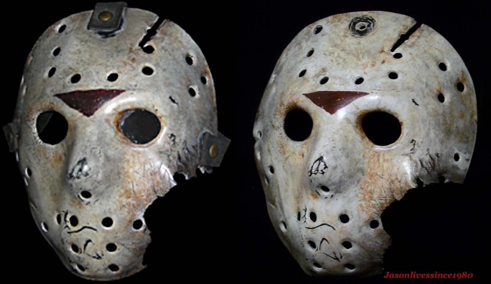
On the part 3 mask for example, they made sure that the major damaged areas are roughly evenly spaced apart, and that each larger scuff is in its own quadrant of the mask. The "puck" mark in the middle of the forehead interrupts what would otherwise be a wide, blank space, drawing the eye to the center; the blackish rim of dirt on the outer edge of the left eye is actually a focal point from which dirt and damage fans out across the left side of the mask; the various dirty spots and scuffs that form a sort of "raccoon" or goggle pattern around the eyes and nose, encircling the brow are balanced across the mask. Major damage is balanced, though not duplicated (because that would look too fake) on each side. The left side has the dirty eye rim and a large streak of dirt running from the left eye like a tear drop; they are balanced on the right by the mouth scuff and the black streak on the right cheek. They put a thin, but elongated scratch across the upper left forehead so that side wouldn't be too bare, balancing that with a very dirty upper right border. Underneath it all are the beautiful wavy contours of the crackle medium, cracked into a variety of strips and blocks across the surface, following the curves of the plastic. If you could find that part 3 hock in the L.A. landfill its in today, you might truly be holding a work of art (depending on the condition its in).
The part 4 mask, though weathered very differently, has similar elements of composition, though its perhaps stronger on texture and the use of lines than the part 3. On the left side, there is a heavy bit of scratching with contoured lines that fan out from the outer left eye hole, reaching across the temple area, curving around the eye socket into the cheek and creeping onto the nose. The lines are not perfectly parallel but chaotically intersect and merge, forming a spiderweb pattern before disappearing toward the outer edge of the mask. The front of the mask has contrasting, roughly linear diagonal scratches that cover the mouth and parts of the forehead. They don't have the chaotic weaving of the eye marks, but are shorter and rigidly parallel in the mouth area. All of these details (and far more, too numerous to mention) combine to form a mask that appears to be naturally weather-beaten by random occurrence. The texture in the dirt, scratches and other tiny bits of damage make it really amazing close up and makes for a work of art that is really beautiful in its ugliness.
Unfortunately, almost none of these finer details can be seen on film. Thus, they are almost never replicated by most hock artists. Not to knock anyone, but it would be nice to see more people really do their homework and try to reproduce the artistry that Robb Wilson King had used in creating the originals. The part 7 mask made by KNB has similar compositional elements used, making it another real work of art.
Anyway, thats one of the reasons I like doing hocks. I like finding art in things that are dark and dismal I suppose, and I like to see a professional really dedicate himself to finer details, even if they don't really show up onscreen.