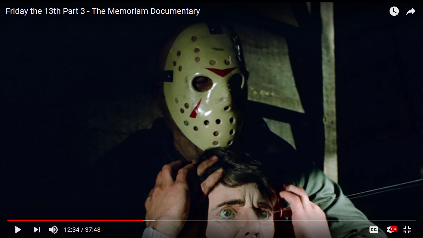
Stan Winston Studios posted these recently on their social media in honor of the recent Friday the 13th. Really nice photos of casting Richard's face for the original sculpt used in Part III. You can also see the exaggerated mauve flesh tones used in painting the final pieces. FX guys usually did this knowing that color timing would inevitably rob the piece of some amount of it's original color.
Showing posts with label Friday the 13th part 3. Show all posts
Friday, October 20, 2023
New Stan Winston Jason Photos Revealed
Saturday, March 11, 2023
Friday, May 20, 2022
Couple of Pieces on eBay Right Now
My Hideous Looking Man and my Crash part 3 hockey mask are both currently on eBay.
Click here for the Hideous Looking Man.
This might be your only chance to own a HLM. There are only a dozen or so out there and I haven't seen one come up for sale in nearly a decade.
Friday, May 13, 2022
New Photos of Stan Winston's Part 3 Sculpt Released
Just when you think you've seen them all. These photos are just incredible. Stan Winston studios apparently just released the on their social media in celebration of Friday the 13th today.
Tuesday, January 16, 2018
Thursday, August 27, 2015
1:1 Part III Hero Mask
Painted by me on a P82. I tried to capture every single crack and scuff exactly as it was on the movie mask using the best photos I could get my hands on. Painted this back in 2012 but haven't really taken decent photos until recently.
Labels:
Friday the 13th part 3,
Jason mask,
Richard Brooker
Sunday, January 4, 2015
What color was the part 3 mask?
UPDATE 4/24/17: Don't bother getting an acrylic paint to basecoat a part 3 with. Spray it Dover white and get Maimeri's patina varnish and paint it just like the FX guys (probably) did. See this post for instructions.
I've addressed this subject on the forums in years past, but wanted a version of my argument on the blog for posterity's sake. Back in 2009 and earlier when I first started painting these people used to paint the part 3/4 masks a variety of colors due to the fact that the masks look so different in the films. Were they white? Beige? Yellow? Sandshell? (lol), or something in between? Since then hock painters have standardized their color into a light lemon yellow color, which I believe to be inaccurate, as I will explain.
For starters, do not trust what you see in the film. Lighting can affect the appearance of the mask, as can color timing in post production. So how do we really know what color it was?
Well back in December 2009 I asked Robb Wilson King, the art director who worked on Friday the 13th part 3 and painted the originals. He described it as a "cream color" created by a "slight aged patina" over an off-white base. I took this to mean that the "cream color" was some sort of translucent glaze designed to give the mask weathering some depth, but can't be sure.
Regardless... as you can see from the several behind-the-scenes photos below here the mask wasn't exactly yellow, although there were yellow undertones in the color that will emphasize in certain lighting conditions. It was a sort of caramel-beige color. Call it a "cream color" if you like. My own approximation of it is at upper left.
Some painters have alleged that the mask changed colors over the years. But the above photos were taken between 1982 and 2010 or so. They all show the same color. So this theory is false.
This is the color I used to paint my masks. It took tons of trial and error to get it right with an acrylic mix but I think accuracy is the way to go. There was an acrylic color called "camel" at Joann Fabrics they used to sell that was extremely close. So there you have it. The mask may have looked white onscreen in certain scenes if the beige layer was translucent. Perhaps Dario Latinovic, who owns the part 4 mask can shed some light on this.
Update: Need more proof? Jesus Christ you're stubborn. Here you go, Dario with the real thing. It's beige, not yellow:
I've addressed this subject on the forums in years past, but wanted a version of my argument on the blog for posterity's sake. Back in 2009 and earlier when I first started painting these people used to paint the part 3/4 masks a variety of colors due to the fact that the masks look so different in the films. Were they white? Beige? Yellow? Sandshell? (lol), or something in between? Since then hock painters have standardized their color into a light lemon yellow color, which I believe to be inaccurate, as I will explain.
For starters, do not trust what you see in the film. Lighting can affect the appearance of the mask, as can color timing in post production. So how do we really know what color it was?
Well back in December 2009 I asked Robb Wilson King, the art director who worked on Friday the 13th part 3 and painted the originals. He described it as a "cream color" created by a "slight aged patina" over an off-white base. I took this to mean that the "cream color" was some sort of translucent glaze designed to give the mask weathering some depth, but can't be sure.
Regardless... as you can see from the several behind-the-scenes photos below here the mask wasn't exactly yellow, although there were yellow undertones in the color that will emphasize in certain lighting conditions. It was a sort of caramel-beige color. Call it a "cream color" if you like. My own approximation of it is at upper left.
Some painters have alleged that the mask changed colors over the years. But the above photos were taken between 1982 and 2010 or so. They all show the same color. So this theory is false.
This is the color I used to paint my masks. It took tons of trial and error to get it right with an acrylic mix but I think accuracy is the way to go. There was an acrylic color called "camel" at Joann Fabrics they used to sell that was extremely close. So there you have it. The mask may have looked white onscreen in certain scenes if the beige layer was translucent. Perhaps Dario Latinovic, who owns the part 4 mask can shed some light on this.
Update: Need more proof? Jesus Christ you're stubborn. Here you go, Dario with the real thing. It's beige, not yellow:
If you're a hock painter and you want to achieve this color, go get this and basecoat away:
UPDATE: Better yet, somebody try out this spray paint and let me know how it works! American Accents "Strawflower"
https://mobileimages.lowes.com/product/converted/020066/020066792787.jpg
Subscribe to:
Posts (Atom)